Bicycle Black Widow now live on Kickstarter
-
montecarlojoe

- Moderator

- Posts: 2529
- Joined: Mon Jun 24, 2013 7:10 am
- Collector: Yes
- Player: Yes
- White Whale: Avant Guard UL Gr - No17 Crown
- Decks Owned: 690
- Location: Portsmouth, England
- Has thanked: 253 times
- Been thanked: 268 times
- Contact:
Re: Bicycle Black Widow
Red hourglass... or two stylised hearts point to point for a nice joker reveal?


Re: Bicycle Black Widow now live on Kickstarter
I wished to post an update to the community here about some further developments to my Black Widow deck. I am striving to further improve the overall aspect of the deck and its art and will continue to do so. If I can succeed with this project then the best and final works will become the Black Widow deck.
I hadn't yet presented a Joker for the deck on the project yet. I had been working with several different ideas on that card. Some of which would have been a 'symbol' sort of graphic. But, since one of the main features of this deck is the stylized Black Widow figure - and many people have mentioned that the top view angle does not show the red hourglass - I decided to create a similar stylized illustration for the Joker card, and this being a perspective that boldly displays the hourglass. Also, it has the same sort of look and stylized art style as the other Widow image.
I think that it makes for an interesting Joker card - I then further decided that I would include in the deck and additional Joker card with a special added twist to its image. The card could then be used in many imaginative presentational ways.
I hope that some of you do appreciate what I am trying to do and accomplish. I truly do love card arts - and I know that mine are not the best, but they are diligent efforts on my part. And I think that they will make some decently admirable card arts.
Let me know what you think of the jokers and their counterpart:
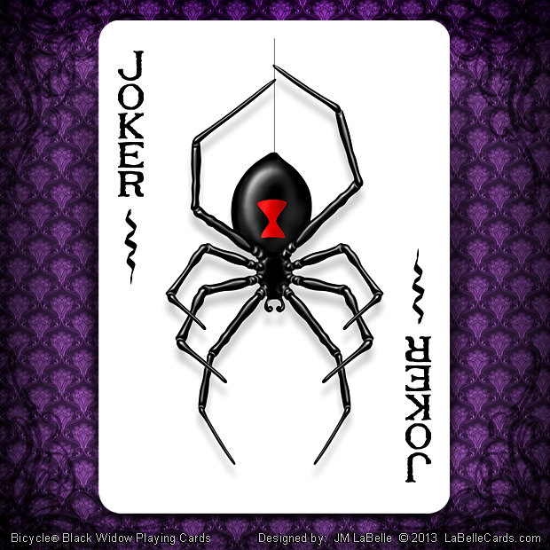
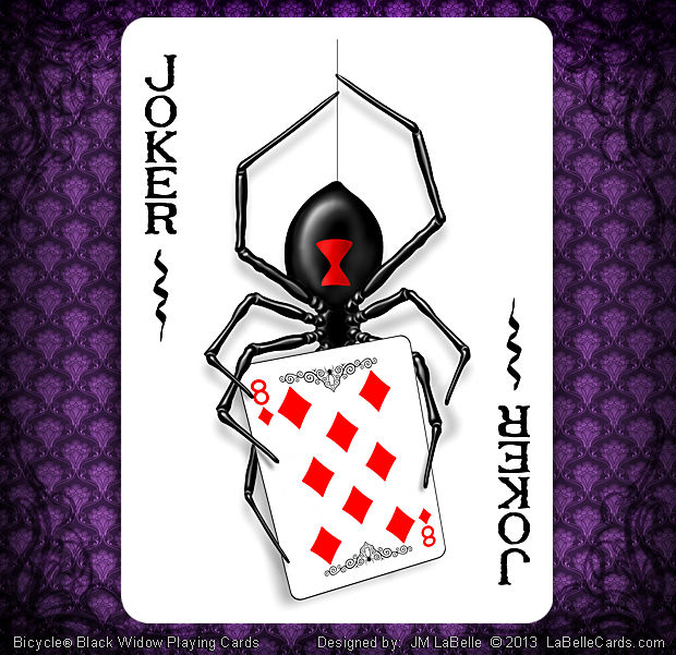
Thanks ~ Jean
I hadn't yet presented a Joker for the deck on the project yet. I had been working with several different ideas on that card. Some of which would have been a 'symbol' sort of graphic. But, since one of the main features of this deck is the stylized Black Widow figure - and many people have mentioned that the top view angle does not show the red hourglass - I decided to create a similar stylized illustration for the Joker card, and this being a perspective that boldly displays the hourglass. Also, it has the same sort of look and stylized art style as the other Widow image.
I think that it makes for an interesting Joker card - I then further decided that I would include in the deck and additional Joker card with a special added twist to its image. The card could then be used in many imaginative presentational ways.
I hope that some of you do appreciate what I am trying to do and accomplish. I truly do love card arts - and I know that mine are not the best, but they are diligent efforts on my part. And I think that they will make some decently admirable card arts.
Let me know what you think of the jokers and their counterpart:
Thanks ~ Jean
-
MagikFingerz

- Site Admin

- Posts: 7780
- Joined: Mon Sep 24, 2012 7:32 pm
- Cardist: Yes
- Collector: Yes
- Player: Yes
- Magician: Yes
- White Whale: Sawdust and Delicious + uncuts
- Location: Norway
- Has thanked: 1767 times
- Been thanked: 1509 times
- Contact:
Re: Bicycle Black Widow now live on Kickstarter
That looks great! Only thing I would get rid of is the squiggly lines below the "JOKER" indices, they just seem unnecessary.
-
CBJ

- Moderator
- Posts: 3177
- Joined: Mon Sep 24, 2012 4:12 pm
- Collector: Yes
- Player: Yes
- Decks Owned: 2000
- Location: Oshawa, Ontario, Canada
- Has thanked: 53 times
- Been thanked: 568 times
- Contact:
-
Magic_Orthodoxy

- Member

- Posts: 2447
- Joined: Fri Feb 22, 2013 6:16 pm
- Collector: Yes
- Magician: Yes
- Decks Owned: 1000
- Has thanked: 344 times
- Been thanked: 152 times
Re: Bicycle Black Widow now live on Kickstarter
those ARE cool
Playing Card & Magic Reviews / https://www.youtube.com/magicorthodoxy
I give away FREE DECKS on INSTAGRAM every month https://www.instagram.com/magicorthodoxy/
I give away FREE DECKS on INSTAGRAM every month https://www.instagram.com/magicorthodoxy/

Re: Bicycle Black Widow now live on Kickstarter
LaBelle,
I like the colored pencil vibrance of the backs, and I rather like the concept of your work. I can see that you put some thought into how the deck is to be presented. What I'm not entirely clear on is the choice of execution in your design elements, as to me they seem to conflict. the variance in line thickness and detail from the spider (the key element) and the court cards. If this deck is designed as a novelty deck, fair. If it's an art deck or deck that highlights an artistic or creative ability and process, I'm afraid it's lost (on me). Would it be something I could see a magician using? I don't think I can envision that because of how easily it is to make out card orientation. Would it make a nice flourish pattern? That's something else I can seem to visualize very well.
Again, if the objective is a to create an artistically expressive novelty deck that shows nuanced variation to the standard courts by way of subtle alteration - your color choices and simple design elements support the execution very nicely, but beyond that, and as a new collector, I have a difficult time understanding the appeal to add one to my collection would be. I guess, it's not so different that I could showcase it and explain a deeper meaningful design.
Full disclosure, I have my eyes (and hopefully hands) on decks with elegant and simple designs - other desks I am eyeing and backing are complex and intricate designs evidencing very careful execution with a basis of well researched concepts. Speaking only for myself, I ask of myself when choosing a deck to add to my collection three very simple questions:
Does this deck have a good use of color in context to the concept?
Did this artist execute the concept in a way that it is easily understood (i.e. what is their approach to the challenge).
Is this deck something that had careful thought and planning, or was it done for the sake of doing it - what is the intent of the deck?
If these questions don't have immediate and inherent answer, I hold a reservation but will afford the artist fairness in asking questions before judging and research their previous work and the art style shown. Do you have other work? I'm just curious.
EDIT:
I agree with the previous comments. The line embellishments under the indices come off as "what can I add to make it appear substantive design." I've learned (the hard way) that the idea of "less is more" is very true in design. Now, I look at what can be removed without diminishing the design before I call it "done;" When I operated under the opposite mode of thought, it was a jumbled mess of "hey look what I can do." Cards a simple in nature - keep is simple, not plain, but simple.
"Morals are evidenced by the courage ethics lack" - Me
Who is online
Users browsing this forum: Bing [Bot], caniveski and 85 guests