Tropical Sunrise Playing Cards: Live on KS
- flashcards
- Member

- Posts: 728
- Joined: Mon Jan 19, 2015 9:02 pm
- Cardist: Yes
- Collector: Yes
- Decks Owned: 600
- Location: Corvallis, Oregon
- Has thanked: 192 times
- Been thanked: 185 times
- Contact:
- vasta41
- Card Oracle

- Posts: 5652
- Joined: Tue Sep 25, 2012 4:45 pm
- Location: Boston, MA
- Has thanked: 1519 times
- Been thanked: 1624 times
Re: Tropical Sunrise Playing Cards: Live on KS
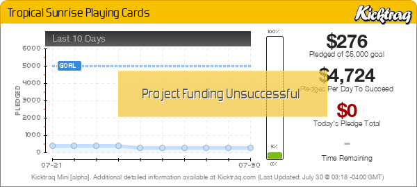
Maybe I'm just a sucker for summer and palm trees but I actually don't think this concept is that bad. It's not very good but with a few tweaks this could be a pretty cool minimalist deck IMO. I love the USPCC printing but the tuck needs to do more. The back design is fine but instead of just a solid blue I wish there were some texture of some sort, like a subtle grid or something. Finally, there should be some type of very minimal change to the pips that accent the theme of the deck. However I do believe this whole post will fall on deaf ears because this project looks like it will never see the light of day. Or sunrise.
-
vedus
- Member

- Posts: 238
- Joined: Mon May 22, 2017 7:01 pm
- Has thanked: 25 times
- Been thanked: 44 times
Re: Tropical Sunrise Playing Cards: Live on KS
I have serious doubts it's going to fund as well as much as I like it as a simple deck.
I'm guessing it's implied that all the faces will be standard.
I'm guessing it's implied that all the faces will be standard.
- shaitani
- Member

- Posts: 303
- Joined: Thu Oct 27, 2016 4:58 pm
- Cardist: Yes
- Collector: Yes
- White Whale: Artistic Spring
- Has thanked: 142 times
- Been thanked: 126 times
Re: Tropical Sunrise Playing Cards: Live on KS
It may fall deaf to the creator, but not on these ears. I hear you, and I agree with you completely. These changes you've suggested would indeed improve the product and push it just over from 'lazy' minimalist deck to 'well designed' minimalist deck. I went ahead and backed for a couple even though I also believe it won't fund, and I may change my mind based on that high ($6) US shipping cost. But maybe hopefully soon we see a new era of artistically designed minimal decks instead of the lazy "I have no artistic talent, so here are some triangles and circles.... it's minimalist because cardistry... also I've been working on it with a team of 3 for the past 12 years" decks.vasta41 wrote:Maybe I'm just a sucker for summer and palm trees but I actually don't think this concept is that bad. It's not very good but with a few tweaks this could be a pretty cool minimalist deck IMO. I love the USPCC printing but the tuck needs to do more. The back design is fine but instead of just a solid blue I wish there were some texture of some sort, like a subtle grid or something. Finally, there should be some type of very minimal change to the pips that accent the theme of the deck. However I do believe this whole post will fall on deaf ears because this project looks like it will never see the light of day. Or sunrise.
Who is online
Users browsing this forum: Sir Toddalot, zuccha, Zzzzi and 72 guests