Page 1 of 5
Re: The Planets — Vanda Artists Series
Posted: Mon Feb 13, 2017 4:51 pm
by MagikFingerz
davegk wrote:@RichK:
Thanks for the notes on the back design...we'll look into some custom modifications for each deck of the series.
I take this to mean that the back design is (or was at least planned to be) the same for all decks, just changing the color scheme. Correct me if I'm wrong.
Which isn't necessarily a bad thing, considering the other customization and variation between the decks. But if the back design lends itself to having small suitable changes done, then that should definitely be explored

Maybe different types of shading could be utilized as well.
Re: The Planets — Vanda Artists Series
Posted: Mon Feb 13, 2017 5:43 pm
by davegk
@JuFin:
My feedback for the pips was pretty similar to yours...I like the rings on the top row but I'm not crazy about how they modify the outer shapes of each symbol. We are looking at variations on the star pips. Also, you are correct, each deck would have the appropriate symbol...they currently all have the Mercury symbol since it was a quick mockup. Same for the symbols on the back design.
@MagikFingerz:
My original intention was to maintain essentially the same back design throughout the series and just change the planet image and the symbol that appears within the 2 circles. We may still stick to that plan unless there are some small changes that make sense, though I don't want to have variations just for the sake of variations—I'd prefer to keep style consistent.
Re: The Planets — Vanda Artists Series
Posted: Tue Feb 14, 2017 12:26 am
by intlgrrl
Have you considered using the Caduceus anywhere on the deck, or would that be too much?
Re: The Planets — Vanda Artists Series
Posted: Thu Feb 16, 2017 11:18 am
by davegk
intlgrrl wrote:Have you considered using the Caduceus anywhere on the deck, or would that be too much?
Hi intlgrrl,
Thanks for the suggestion! We may use the Caduceus on one of the jokers but we'll also need appropriate symbols for each of the other planets as well. I would love to hear ideas for the other planets.
Re: The Planets — Vanda Artists Series
Posted: Thu Feb 16, 2017 5:39 pm
by montecarlojoe
Symbols for the other planets should be fairly straight forward...

Re: The Planets — Vanda Artists Series
Posted: Mon Feb 27, 2017 1:07 pm
by davegk
montecarlojoe wrote:Symbols for the other planets should be fairly straight forward...
Thanks montecarlojoe, but I was actually referring to symbolism imagery similar to the Caduceus that intlgrrl suggested for Mercury. I now have a list of of symbolism we can use for the other decks
Also, here are the designs so far for the jokers. Still in progress a bit—will likely remove the logos and add index icons of some sort.
Re: The Planets — Vanda Artists Series
Posted: Tue Feb 28, 2017 8:52 am
by montecarlojoe
Ah I see - yes certainly Roman gods would be inspiration there.
E.g. Venus - clamshell, Terra/Gaia - Tree (Yggdrasil), Mars - Weapon / Sword, etc
Re: The Planets — Vanda Artists Series
Posted: Wed Mar 01, 2017 7:55 pm
by davegk
More images + feedback requested...
Below are 2 versions of the ace of spades. Curious what you guys think and if you have a preference between them.
Also, for the back design we're deciding between a black background or a white background. Obviously the white borders would match the card fronts, but the black would match the tuckbox. So, which do you prefer?
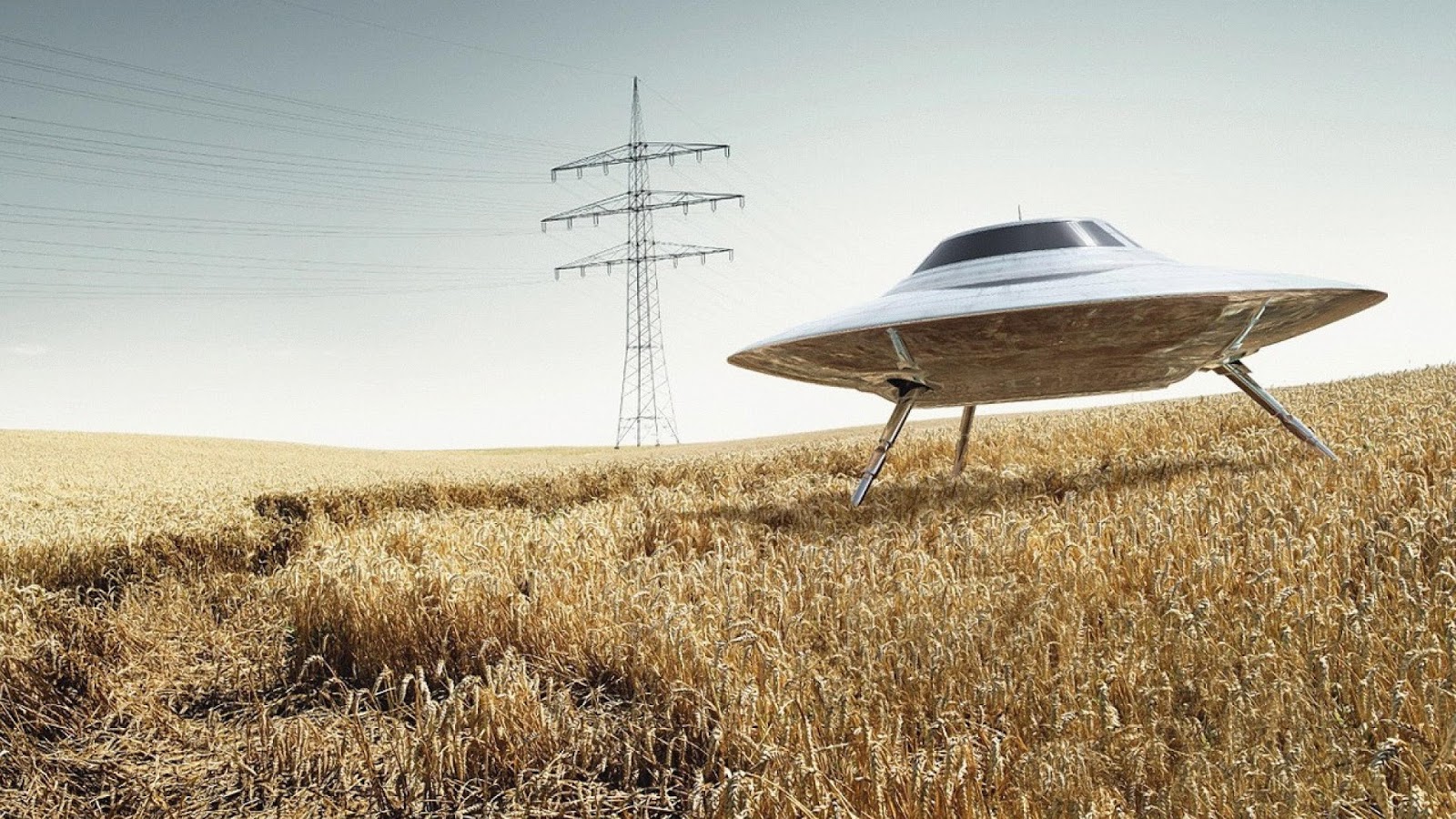
We've also played around with the UFO design and generally decided that a flat bottom with no legs works best. The back design would have the diamond touching the bottom of the UFO, as if laser beams were coming out of the UFO to surround the planet below.
I'm also happy to answer any questions...
Thanks,
David
Re: The Planets — Vanda Artists Series
Posted: Wed Mar 01, 2017 11:13 pm
by JuFiN
Its the left side all the way through for me! Not a fan of black backs or fronts of cards, causes the edges to wear more quickly when used I find. The ace of spades on the left is more light/bright with less black in there, makes it pop more in my opinion. And the UFO legs separate from the beams looks awkward atleast as presented here with them being level with the beam, looks better connected.
Re: The Planets — Vanda Artists Series
Posted: Wed Mar 01, 2017 11:35 pm
by intlgrrl
davegk wrote:montecarlojoe wrote:Symbols for the other planets should be fairly straight forward...
Thanks montecarlojoe, but I was actually referring to symbolism imagery similar to the Caduceus that intlgrrl suggested for Mercury. I now have a list of of symbolism we can use for the other decks
Also, here are the designs so far for the jokers. Still in progress a bit—will likely remove the logos and add index icons of some sort.
jokers.jpg
I'm really liking how this deck is coming along!
Re: The Planets — Vanda Artists Series
Posted: Thu Mar 02, 2017 4:47 am
by flashcards
My two cents:
Left Ace
Right (dark) back
Left UFO(no legs)
I really like how you worked the symbol for mercury into the design. The project is really coming along.
Re: The Planets — Vanda Artists Series
Posted: Thu Mar 02, 2017 5:07 am
by Kage X
flashcards wrote:My two cents:
Left Ace
Right (dark) back
Left UFO(no legs)
My choice as well.
Launch this quickly, please.
Re: The Planets — Vanda Artists Series
Posted: Thu Mar 02, 2017 7:44 am
by MagikFingerz
flashcards wrote:My two cents:
Left Ace
Right (dark) back
Left UFO(no legs)
Same here.
Re: The Planets — Vanda Artists Series
Posted: Thu Mar 02, 2017 7:45 am
by Wanderer
Lovely, but as something very simple. And the reverse side of the card does not represent anything special. But in general, not bad. Reminiscent of cartoon characters.
Re: The Planets — Vanda Artists Series
Posted: Thu Mar 02, 2017 7:50 am
by montecarlojoe
I think that's the idea - 50's / 60's space race era stylising . For me it's pitch perfect
Re: The Planets — Vanda Artists Series
Posted: Thu Mar 02, 2017 12:56 pm
by RichK
I'm for...
Left Ace
Either back color
Left UFO...like how it "boxes" the planet.
Question, should the card back match the legs/no legs UFO? I hope it will. The white and "brown" left picture would be great back but I imagine printing would be impossible.
Re: The Planets — Vanda Artists Series
Posted: Thu Mar 02, 2017 4:01 pm
by davegk
Thanks for the feedback, guys!
We'll probably be going with a modified version of the left ace, the black back design, and the UFO without legs. The tuckbox will be foil and white ink on a black paper stock, so it won't work to have a white background for the back of the tuck.
Will keep you updated with final art decisions and deck/tuck proofs once they're printed. Not sure of launch date yet but likely in April or May.
Re: The Planets — Vanda Artists Series
Posted: Thu Mar 02, 2017 4:31 pm
by JuFiN
Would it be possible to add white I to the card back as you have for the tuck box image? I think it looks better than just gold on black.
Re: The Planets — Vanda Artists Series
Posted: Thu Mar 02, 2017 5:58 pm
by MagikFingerz
JuFiN wrote:Would it be possible to add white I to the card back as you have for the tuck box image? I think it looks better than just gold on black.
I second this motion.
Re: The Planets — Vanda Artists Series
Posted: Fri Mar 03, 2017 11:35 am
by RichK
JuFiN wrote:Would it be possible to add white I to the card back as you have for the tuck box image? I think it looks better than just gold on black.
I approve of this request too if it's possible to do. I half-assed asked you this question above.
Re: The Planets — Vanda Artists Series
Posted: Fri Mar 03, 2017 1:04 pm
by davegk
JuFiN wrote:Would it be possible to add white I to the card back as you have for the tuck box image? I think it looks better than just gold on black.
Thanks for the suggestion! I had actually been considering this already and I think we will probably do it since there seems to be unanimous interest so far.
Re: The Planets — Vanda Artists Series
Posted: Sat Mar 04, 2017 5:01 am
by serubi
This is such a cool idea! I'm completely hooked. Also a smart idea with a collection that makes a planet when it's complete. That'll definitely make people want them all

Re: The Planets — Vanda Artists Series
Posted: Tue Mar 14, 2017 11:22 am
by davegk
Hey guys,
Quick update...just wanted to post the new version of the ace of spades...
Re: The Planets — Vanda Artists Series
Posted: Tue Mar 14, 2017 11:31 am
by montecarlojoe
You probably don't want multiple AoS but it'd be cool if the sun got smaller the further away the planet is...
Re: The Planets — Vanda Artists Series
Posted: Tue Mar 14, 2017 11:46 am
by davegk
montecarlojoe wrote:You probably don't want multiple AoS but it'd be cool if the sun got smaller the further away the planet is...
Hmm...that's an interesting idea to consider—thanks!
Re: The Planets — Vanda Artists Series
Posted: Wed Mar 22, 2017 11:24 am
by davegk
Hey all,
We're getting close to finalizing the designs. Here's a quick poll for you...we've been working on the back design a bit to try to incorporate a black background but also have white borders. Below are 4 options Srdjan created. Please let me know which one you like best.
Also we have a couple additional surprises that will be revealed when the project launches.
Thanks!
-David
Re: The Planets — Vanda Artists Series
Posted: Wed Mar 22, 2017 2:01 pm
by MagikFingerz
Of the 4 options I would have to vote for number 1.
HOWEVER, I feel like there's a missed opportunity here. What I would like to see is the gold swirls of the outer design to extend slightly over the white borders, like the already do a bit on the long edge, but all the way around. This would be complemented by either A: removing the outer frame of the back design altogether, or still having it in the background but white (like in option 2).
Let me know if that doesn't make sense, and I can try to illustrate.
Re: The Planets — Vanda Artists Series
Posted: Wed Mar 22, 2017 6:43 pm
by shermjack
I agree that 1 is the best of the 4, but would be interested in seeing Tom's suggestion if possible

Re: The Planets — Vanda Artists Series
Posted: Wed Mar 22, 2017 8:59 pm
by shaitani
I may be alone on this, but I actually like #4 the most, followed by #2.
#1 is the safest because every deck does it that way and it looks fine. But I like #4 because it creates two levels of border in a way we don't really see very often, and I thought it was cool and fitting. #2 I preferred because it did as MagikFingerz was describing, it kind of allows some more of the design to creep outside of the border (or at least it simulates it).
Re: The Planets — Vanda Artists Series
Posted: Thu Mar 23, 2017 3:08 am
by TGunitedcardists
None of above. The hat on the inner diamond is exactly the same making the back one way. In addition, the planet in the middle makes it one way.