I agree. I dont mind all female courts, and I think the mask idea is a good one.cherrynukacola wrote:Oh wow, the courts are looking great.
The Ritual - Design Revision....help!
-
Sher

- Moderator

- Posts: 1392
- Joined: Sun Nov 03, 2013 7:00 am
- Collector: Yes
- Decks Owned: 100
- Location: Guam, United States
- Has thanked: 56 times
- Been thanked: 81 times
Re: The Ritual - Design Revision....help! (wap)
-
52Ravens

- ✔ VERIFIED Designer

- Posts: 171
- Joined: Mon Jun 30, 2014 3:28 pm
- Collector: Yes
- Player: Yes
- Magician: Yes
- Decks Owned: 34
- Has thanked: 13 times
- Been thanked: 80 times
- Contact:
Re: The Ritual - Design Revision....help!
Todays offering is the king of spades and the king of hearts
- Attachments
-
- KH-KS.jpg (305.95 KiB) Viewed 1795 times
-
Eoghann

- Moderator
- Posts: 3467
- Joined: Sat Jul 20, 2013 10:47 am
- Collector: Yes
- Player: Yes
- Has thanked: 153 times
- Been thanked: 428 times
-
Godzillian

- Member

- Posts: 291
- Joined: Sun Oct 27, 2013 4:21 pm
- Been thanked: 5 times
Re: The Ritual - Design Revision....help!
What the fudge!? Last time I came to this thread, the only courts I saw were the plain & simple decapitated head ones. These new courts look AMAZING. I'm a secret crow lover. I didn't back these last time because of the price point & the courts. But now, I'll definitely be in for some.
All female courts? Whoooo! Kings & Jacks wearing masks is a cool idea too.
+1+1+1+1!
All female courts? Whoooo! Kings & Jacks wearing masks is a cool idea too.
+1+1+1+1!
-
MagikFingerz

- Site Admin

- Posts: 7780
- Joined: Mon Sep 24, 2012 7:32 pm
- Cardist: Yes
- Collector: Yes
- Player: Yes
- Magician: Yes
- White Whale: Sawdust and Delicious + uncuts
- Location: Norway
- Has thanked: 1767 times
- Been thanked: 1509 times
- Contact:
Re: The Ritual - Design Revision....help!
Shouldn't the tip of the KoH's sword be visible on the left? Would probably have to be behind the pip, but still. Looks like it just disappears.
-
52Ravens
- ✔ VERIFIED Designer
- Posts: 171
- Joined: Mon Jun 30, 2014 3:28 pm
- Collector: Yes
- Player: Yes
- Magician: Yes
- Decks Owned: 34
- Has thanked: 13 times
- Been thanked: 80 times
- Contact:
Re: The Ritual - Design Revision....help!
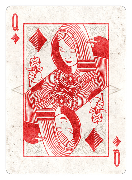
Queen of Diamonds to look at today. Let me know what you think
-
52Ravens
- ✔ VERIFIED Designer
- Posts: 171
- Joined: Mon Jun 30, 2014 3:28 pm
- Collector: Yes
- Player: Yes
- Magician: Yes
- Decks Owned: 34
- Has thanked: 13 times
- Been thanked: 80 times
- Contact:
Re: The Ritual - Design Revision....help!
I did notice this but the standard design is like this. I never noticed it before now. I think I'm going to keep it as it is for now as I don't really want the tip coming our the other side and crashing with the pip. Really appreciate the feedback thoughMagikFingerz wrote:Shouldn't the tip of the KoH's sword be visible on the left? Would probably have to be behind the pip, but still. Looks like it just disappears.
-
Eoghann
- Moderator
- Posts: 3467
- Joined: Sat Jul 20, 2013 10:47 am
- Collector: Yes
- Player: Yes
- Has thanked: 153 times
- Been thanked: 428 times
-
montecarlojoe

- Moderator
- Posts: 2529
- Joined: Mon Jun 24, 2013 7:10 am
- Collector: Yes
- Player: Yes
- White Whale: Avant Guard UL Gr - No17 Crown
- Decks Owned: 690
- Location: Portsmouth, England
- Has thanked: 253 times
- Been thanked: 268 times
- Contact:
Re: The Ritual - Design Revision....help!
Yeah - very cool stuff here - the monochrome, the ravens, and the all female courts are unique - all brilliant. I'll definitely be after a deck or two!
-
52Ravens
- ✔ VERIFIED Designer
- Posts: 171
- Joined: Mon Jun 30, 2014 3:28 pm
- Collector: Yes
- Player: Yes
- Magician: Yes
- Decks Owned: 34
- Has thanked: 13 times
- Been thanked: 80 times
- Contact:
Re: The Ritual - Design Revision....help!
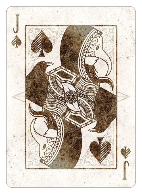
Finished the Jack of Spades today, thanks again for your feedback
-
Godzillian
- Member
- Posts: 291
- Joined: Sun Oct 27, 2013 4:21 pm
- Been thanked: 5 times
Re: The Ritual - Design Revision....help!
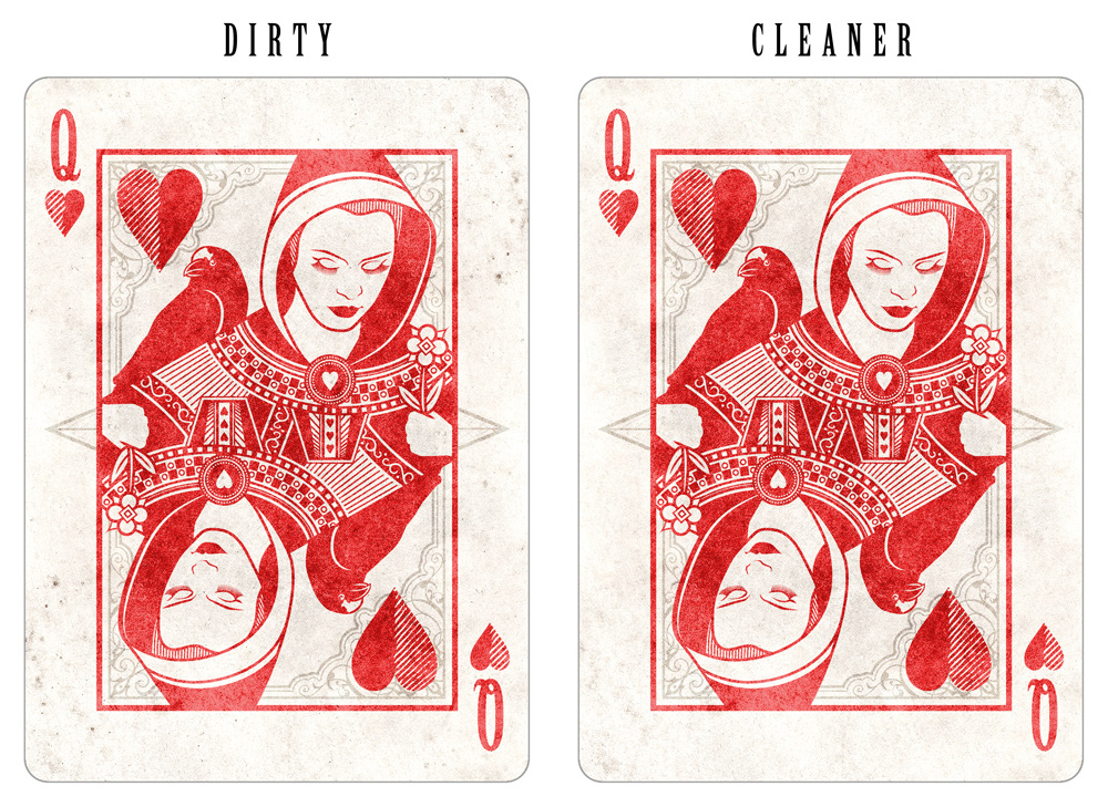
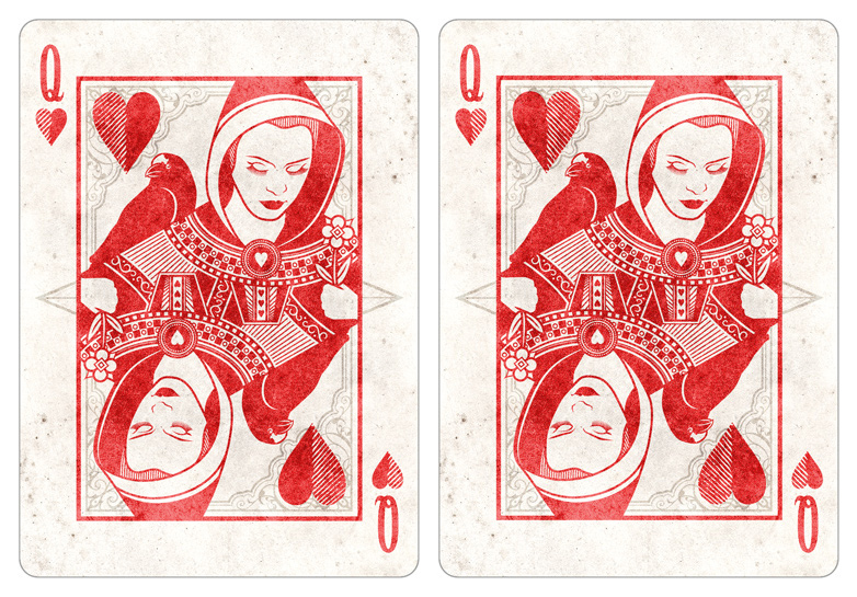
Would you consider getting rid of the dirt & random specks/dots on the front of the cards? I think it'd make the deck classier and cleaner.
EDIT: Same suggestion goes for the backs. Also, JoQ looks sick.
EDIT: Same suggestion goes for the backs. Also, JoQ looks sick.
-
MagikFingerz
- Site Admin
- Posts: 7780
- Joined: Mon Sep 24, 2012 7:32 pm
- Cardist: Yes
- Collector: Yes
- Player: Yes
- Magician: Yes
- White Whale: Sawdust and Delicious + uncuts
- Location: Norway
- Has thanked: 1767 times
- Been thanked: 1509 times
- Contact:
Re: The Ritual - Design Revision....help!
Jack of Queens?Godzillian wrote:Would you consider getting rid of the dirt & random specks/dots on the front of the cards? I think it'd make the deck classier and cleaner.
EDIT: Same suggestion goes for the backs. Also, JoQ looks sick.
I think I agree though, you could at least do it on some of the cards and make a side-by-side comparison.
-
montecarlojoe
- Moderator
- Posts: 2529
- Joined: Mon Jun 24, 2013 7:10 am
- Collector: Yes
- Player: Yes
- White Whale: Avant Guard UL Gr - No17 Crown
- Decks Owned: 690
- Location: Portsmouth, England
- Has thanked: 253 times
- Been thanked: 268 times
- Contact:
Re: The Ritual - Design Revision....help!
I think there are two textures here - the foxing, dirt and water spotes are in teh background - underneath everything else - but there is also a sort of worn stone texture aplied to the main design and indexes.
I quite like it but maybe that stone texture could be toned down a bit - it's much more noticable on the black suits.
I quite like it but maybe that stone texture could be toned down a bit - it's much more noticable on the black suits.
-
52Ravens
- ✔ VERIFIED Designer
- Posts: 171
- Joined: Mon Jun 30, 2014 3:28 pm
- Collector: Yes
- Player: Yes
- Magician: Yes
- Decks Owned: 34
- Has thanked: 13 times
- Been thanked: 80 times
- Contact:
Re: The Ritual - Design Revision....help!
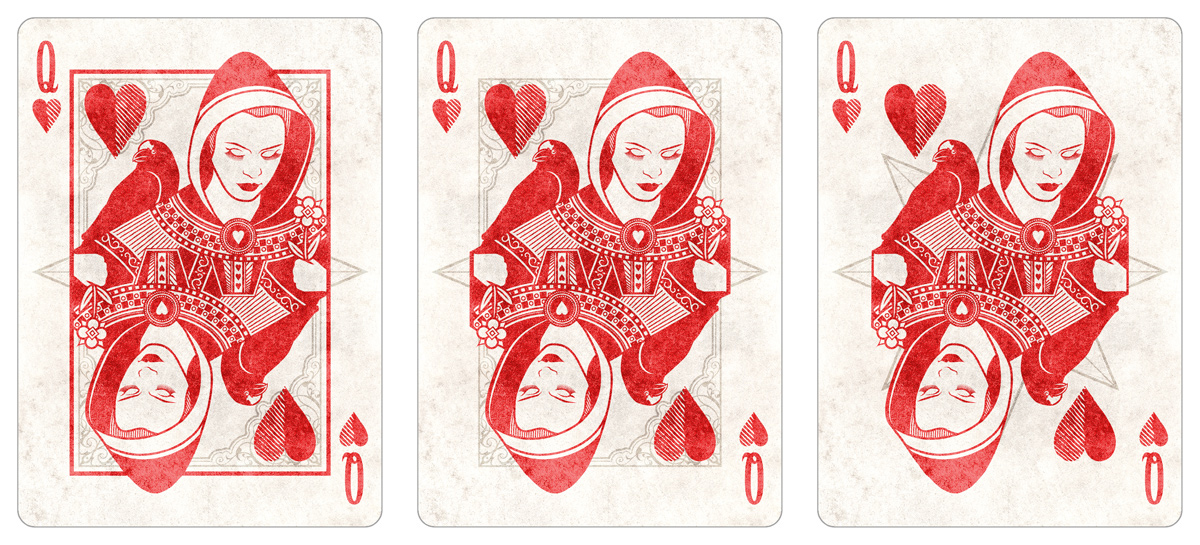
Thanks for the feedback guys, I've given some options below for you to look at.
I kind of like the dirty dots in the corners as I feel it gives it a bit of character, but below I have the dirty and clean versions. What do you think?
Then there is the matter of the texture on the colour section of the cards being too prominent. I think you're right, below are the examples, but looking at them side by side, I think I'll keep the red as it is and use the new black version but bring it back a little towards the original as I think it looks too dark.....but what do you guys think?
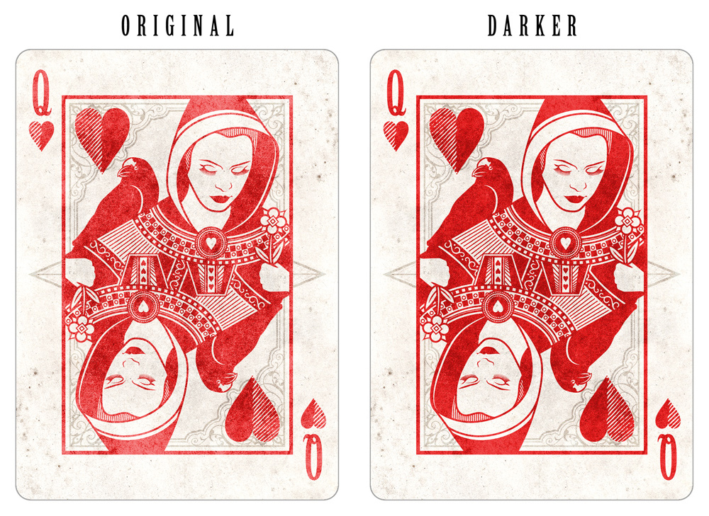
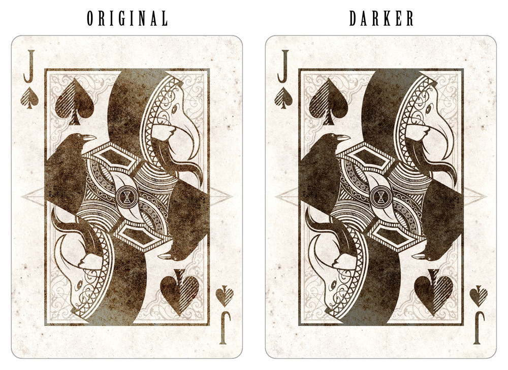
Ps, its one background texture, the card image design is used as a mask to manipulate the background texture beneath to be red/black. Haha some "behind the curtain" insight for you there!
I kind of like the dirty dots in the corners as I feel it gives it a bit of character, but below I have the dirty and clean versions. What do you think?
Then there is the matter of the texture on the colour section of the cards being too prominent. I think you're right, below are the examples, but looking at them side by side, I think I'll keep the red as it is and use the new black version but bring it back a little towards the original as I think it looks too dark.....but what do you guys think?
Ps, its one background texture, the card image design is used as a mask to manipulate the background texture beneath to be red/black. Haha some "behind the curtain" insight for you there!
-
Godzillian
- Member
- Posts: 291
- Joined: Sun Oct 27, 2013 4:21 pm
- Been thanked: 5 times
Re: The Ritual - Design Revision....help!
LOL! Not sure what I was thinking, haha.MagikFingerz wrote:Jack of Queens?Godzillian wrote:Would you consider getting rid of the dirt & random specks/dots on the front of the cards? I think it'd make the deck classier and cleaner.
EDIT: Same suggestion goes for the backs. Also, JoQ looks sick.
I think I agree though, you could at least do it on some of the cards and make a side-by-side comparison.
I do prefer the cleaner version, but I also think it's personal preference. I can't tell the difference between the "Original" and "Darker" versions either, but maybe it's my computer screen or my eyes. Maybe someone else can offer critique on that?
-
montecarlojoe
- Moderator
- Posts: 2529
- Joined: Mon Jun 24, 2013 7:10 am
- Collector: Yes
- Player: Yes
- White Whale: Avant Guard UL Gr - No17 Crown
- Decks Owned: 690
- Location: Portsmouth, England
- Has thanked: 253 times
- Been thanked: 268 times
- Contact:
Re: The Ritual - Design Revision....help!
I agree - the cleaner version looks good - I also agree that the original red texture looks fine and the darker blacks match better.
Looking sharp!
Looking sharp!
-
sprouts1115
- Deck Artist

- Posts: 1897
- Joined: Thu Oct 11, 2012 10:05 am
- Collector: Yes
- Decks Owned: 50
- Location: san antonio, tx, usa
- Has thanked: 98 times
- Been thanked: 113 times
- Contact:
Re: The Ritual - Design Revision....help!
I'm for cleaner/darker. Also lets see one with the stripe suit on the right side and and solid on the left. I'm thinking it might be easier to read them when looking at them in a spread or in a peek position. I think your getting close to having a final product.
- Attachments
-
- Screenshot 2014-07-11 19.09.10.png (7.69 KiB) Viewed 1088 times
RussellSprouts
-
montecarlojoe
- Moderator
- Posts: 2529
- Joined: Mon Jun 24, 2013 7:10 am
- Collector: Yes
- Player: Yes
- White Whale: Avant Guard UL Gr - No17 Crown
- Decks Owned: 690
- Location: Portsmouth, England
- Has thanked: 253 times
- Been thanked: 268 times
- Contact:
-
52Ravens
- ✔ VERIFIED Designer
- Posts: 171
- Joined: Mon Jun 30, 2014 3:28 pm
- Collector: Yes
- Player: Yes
- Magician: Yes
- Decks Owned: 34
- Has thanked: 13 times
- Been thanked: 80 times
- Contact:
Re: The Ritual - Design Revision....help!
Thanks for the help, so it looks like we are going with clean, the original reds and the toned back darker blacks!
you are right. I've been looking at this and can't decide, what do you guys think? Strips on the left or the right?
(Sorry, had my stag party saturday so I've been a little preoccupied)
you are right. I've been looking at this and can't decide, what do you guys think? Strips on the left or the right?
(Sorry, had my stag party saturday so I've been a little preoccupied)
-
52Ravens
- ✔ VERIFIED Designer
- Posts: 171
- Joined: Mon Jun 30, 2014 3:28 pm
- Collector: Yes
- Player: Yes
- Magician: Yes
- Decks Owned: 34
- Has thanked: 13 times
- Been thanked: 80 times
- Contact:
Re: The Ritual - Design Revision....help!
Clean he says, just realising that I've used the old background!52Ravens wrote:Thanks for the help, so it looks like we are going with clean,
-
montecarlojoe
- Moderator
- Posts: 2529
- Joined: Mon Jun 24, 2013 7:10 am
- Collector: Yes
- Player: Yes
- White Whale: Avant Guard UL Gr - No17 Crown
- Decks Owned: 690
- Location: Portsmouth, England
- Has thanked: 253 times
- Been thanked: 268 times
- Contact:
-
sprouts1115
- Deck Artist
- Posts: 1897
- Joined: Thu Oct 11, 2012 10:05 am
- Collector: Yes
- Decks Owned: 50
- Location: san antonio, tx, usa
- Has thanked: 98 times
- Been thanked: 113 times
- Contact:
Re: The Ritual - Design Revision....help!
Might I also suggest you can extend into no mans land with your courts. MagikFingerz loves smaller borders as so do I. It also leaves more room for your art. Don't be scarred just do it. I would love to see more hood on the QoH. Remember we are always tying to test the boundaries and you have plenty of room. No Mans land is Halfway pass the dotted USPCC die to the cut border. Believe me, I have asked many of times they will not give me an exact distance. Your indices are are right on the no mans land just expand your courts. I'm trying to give you a better deck....
- Attachments
-
- Screenshot 2014-07-14 18.52.10.png (21.68 KiB) Viewed 1092 times
RussellSprouts
-
MagikFingerz
- Site Admin
- Posts: 7780
- Joined: Mon Sep 24, 2012 7:32 pm
- Cardist: Yes
- Collector: Yes
- Player: Yes
- Magician: Yes
- White Whale: Sawdust and Delicious + uncuts
- Location: Norway
- Has thanked: 1767 times
- Been thanked: 1509 times
- Contact:
Re: The Ritual - Design Revision....help!
I like solid outwards/stripes inwards better, makes it more balanced and as sprouts said it's more functional. Not sure about how borderless courts would work, since they're very traditional and work very well with the borders. Only one way to find out though 
-
52Ravens
- ✔ VERIFIED Designer
- Posts: 171
- Joined: Mon Jun 30, 2014 3:28 pm
- Collector: Yes
- Player: Yes
- Magician: Yes
- Decks Owned: 34
- Has thanked: 13 times
- Been thanked: 80 times
- Contact:
Re: The Ritual - Design Revision....help!
Ok, so below we have the QoH expanding into the no mans land, and though its only a little thing I think it'll stay, you're right it does break it out and it remains traditional. I did look at the ravens busting out of the border too but I think that it'll be distracting when fanning the cards, the hoods are at the top and I doubt they will impact much when it comes to handling.
We also have quick tests for almost borderless and borderless layouts. I'm liking the almost borderless but I think the no mans land version is just enough to give it that little something.
Let me know what you think, thanks for your options
We also have quick tests for almost borderless and borderless layouts. I'm liking the almost borderless but I think the no mans land version is just enough to give it that little something.
Let me know what you think, thanks for your options
-
montecarlojoe
- Moderator
- Posts: 2529
- Joined: Mon Jun 24, 2013 7:10 am
- Collector: Yes
- Player: Yes
- White Whale: Avant Guard UL Gr - No17 Crown
- Decks Owned: 690
- Location: Portsmouth, England
- Has thanked: 253 times
- Been thanked: 268 times
- Contact:
Re: The Ritual - Design Revision....help!
I like them all - but the middle one least. Instinctively I'd say the first is the winner - the other's I think would need the same treatment on the sleeves to avoid looking cut off by an invisible border.
Of the two borderless I like very much the 8 point star motif of the last design - looks cleaner.
Of the two borderless I like very much the 8 point star motif of the last design - looks cleaner.
-
Eoghann
- Moderator
- Posts: 3467
- Joined: Sat Jul 20, 2013 10:47 am
- Collector: Yes
- Player: Yes
- Has thanked: 153 times
- Been thanked: 428 times
Re: The Ritual - Design Revision....help!
What Joe said. Number one with borders or number three but with elbows drawn in so it doesn't look cut off.
-
52Ravens
- ✔ VERIFIED Designer
- Posts: 171
- Joined: Mon Jun 30, 2014 3:28 pm
- Collector: Yes
- Player: Yes
- Magician: Yes
- Decks Owned: 34
- Has thanked: 13 times
- Been thanked: 80 times
- Contact:
Re: The Ritual - Design Revision....help!
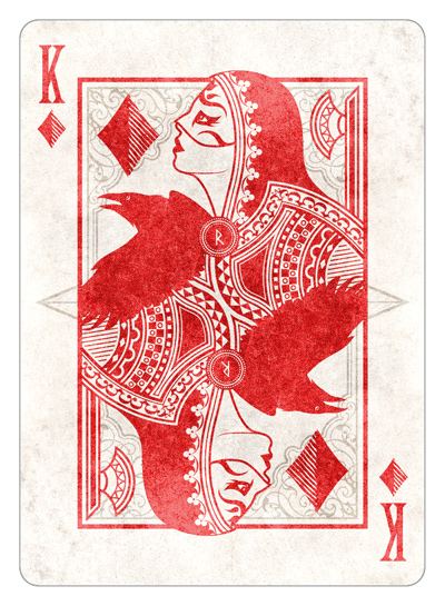
I think I'm going to go with the border version for no other reason than I like them most haha, Maybe it because they seem more traditional that way
Today I have the Kind of Diamonds for you...4 to go! I think once they are all done I'll post one image that has them all on so that we can all compare them to one another and hopefully spot some final amends. Jack of Heart coming next
Today I have the Kind of Diamonds for you...4 to go! I think once they are all done I'll post one image that has them all on so that we can all compare them to one another and hopefully spot some final amends. Jack of Heart coming next
Who is online
Users browsing this forum: No registered users and 74 guests