Love it! 23 daggers, ouch!
One suggestion? The center dagger, the one right on the X, it's making the court card one sided. Kind of defeating the purpose of mirroring the artwork.
MEMENTO a new bycicle deck based on Hystory
-
Eoghann

- Moderator

- Posts: 3467
- Joined: Sat Jul 20, 2013 10:47 am
- Collector: Yes
- Player: Yes
- Has thanked: 153 times
- Been thanked: 428 times
Re: re-design ALPHA Deck
Can't argue with history. 
How about....instead of a dagger you make the center one a bleeding wound instead? Too gruesome? That could make the court symmetrical.
Regardless, I don't exactly mind one way courts, but a lot of people might object to it.
How about....instead of a dagger you make the center one a bleeding wound instead? Too gruesome? That could make the court symmetrical.
Regardless, I don't exactly mind one way courts, but a lot of people might object to it.
-
MagikFingerz

- Site Admin

- Posts: 7780
- Joined: Mon Sep 24, 2012 7:32 pm
- Cardist: Yes
- Collector: Yes
- Player: Yes
- Magician: Yes
- White Whale: Sawdust and Delicious + uncuts
- Location: Norway
- Has thanked: 1767 times
- Been thanked: 1509 times
- Contact:
Re: re-design ALPHA Deck
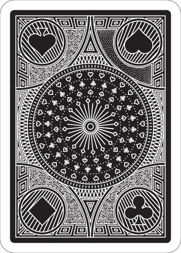
Very many have done the "4 suits on back design", and it almost never works. It makes the back asymmetrical and one-way, which is not what most seem to prefer. In my personal opinion back designs SHOULD be mirrored, it is what separates a good playing card back design from any other type of design.
Another thing to keep in mind is that most people look at the top half first. That back has the pips right way in the bottom half.
I like the kinda "3D room" effect it's got going on though, and the center part is very nice.
Another thing to keep in mind is that most people look at the top half first. That back has the pips right way in the bottom half.
I like the kinda "3D room" effect it's got going on though, and the center part is very nice.
-
Eoghann
- Moderator
- Posts: 3467
- Joined: Sat Jul 20, 2013 10:47 am
- Collector: Yes
- Player: Yes
- Has thanked: 153 times
- Been thanked: 428 times
Re: re-design ALPHA Deck
Aside from the corner pips, I really really like everything else. I agree with Tom in making the back symmetrical. Perhaps working all four pips into each circle if you really want them there. Although I think the back could very well do without them at all.
-
zev hoover
- Member

- Posts: 14
- Joined: Fri Apr 18, 2014 11:46 pm
Re: re-design ALPHA Deck
I agree, put something else in the corners and you have a killer design. one thing, I think your center radial thing with all the lines is not symmetrical. if you just rotate it a smidgen it would be.
oh, and also I think that in the dot fields, you should make the dots a little smaller, or further apart. they seem to be touching, which doesn't really look that good.
seriously though, awesome design.
oh, and also I think that in the dot fields, you should make the dots a little smaller, or further apart. they seem to be touching, which doesn't really look that good.
seriously though, awesome design.
-
MagikFingerz
- Site Admin
- Posts: 7780
- Joined: Mon Sep 24, 2012 7:32 pm
- Cardist: Yes
- Collector: Yes
- Player: Yes
- Magician: Yes
- White Whale: Sawdust and Delicious + uncuts
- Location: Norway
- Has thanked: 1767 times
- Been thanked: 1509 times
- Contact:
Re: re-design ALPHA Deck
The center piece not being symmetrical could be a subtle way of making it a one-way, ie not noticable unless you look very closely or know about it (useful for magicians). Although things like that are usually closer to the edge so as to be visible without having to see the whole back (ie in spreads and fans).zev hoover wrote:I agree, put something else in the corners and you have a killer design. one thing, I think your center radial thing with all the lines is not symmetrical. if you just rotate it a smidgen it would be.
oh, and also I think that in the dot fields, you should make the dots a little smaller, or further apart. they seem to be touching, which doesn't really look that good.
seriously though, awesome design.
The dots I feel are working the way the are, I think it might be intentional for them to be so close. Makes it look like they are the "floor" in a room (the "borders" in the corners have that 3D effect to look like walls).
-
zev hoover
- Member
- Posts: 14
- Joined: Fri Apr 18, 2014 11:46 pm
Re: re-design ALPHA Deck
with the suits being where they are, a subtle one way element is not really necessary, and as you said is almost useless in the middle.
as for the dots, I think the dots on a rider back (for example) look much cleaner, but that could be partially ink bleeding. I think it is also how they sort of wrap around the objects around them, and are not just a smattering.
as for the dots, I think the dots on a rider back (for example) look much cleaner, but that could be partially ink bleeding. I think it is also how they sort of wrap around the objects around them, and are not just a smattering.
-
MagikFingerz
- Site Admin
- Posts: 7780
- Joined: Mon Sep 24, 2012 7:32 pm
- Cardist: Yes
- Collector: Yes
- Player: Yes
- Magician: Yes
- White Whale: Sawdust and Delicious + uncuts
- Location: Norway
- Has thanked: 1767 times
- Been thanked: 1509 times
- Contact:
Re: re-design ALPHA Deck
True. Hopefully the suits in the corners will be removed/replaced.zev hoover wrote:with the suits being where they are, a subtle one way element is not really necessary, and as you said is almost useless in the middle.
as for the dots, I think the dots on a rider back (for example) look much cleaner, but that could be partially ink bleeding. I think it is also how they sort of wrap around the objects around them, and are not just a smattering.
As for the dots, it shouldn't be a problem to make a few quick mock-ups for comparison.
-
zev hoover
- Member
- Posts: 14
- Joined: Fri Apr 18, 2014 11:46 pm
Re: re-design ALPHA Deck
ok, on further inspection the thing in the middle IS semiotical oops. just doesn't look like it. my bad. I am working on a mock up of the dots.
-
zev hoover
- Member
- Posts: 14
- Joined: Fri Apr 18, 2014 11:46 pm
Re: re-design ALPHA Deck
sorry for being so long, here it is. I replaced the upper right dots with ones I prefer. just preference really though.
-
Valerio

- Deck Artist

- Posts: 70
- Joined: Sun Mar 23, 2014 8:56 pm
- Location: Cesena, Italy
- Been thanked: 2 times
Re: re-design ALPHA Deck
another shot...
4 diferent kinds of "dotting" tecnique...
Wich one is the best?!?!?
4 diferent kinds of "dotting" tecnique...
Wich one is the best?!?!?
- Attachments
-
-
Eoghann
- Moderator
- Posts: 3467
- Joined: Sat Jul 20, 2013 10:47 am
- Collector: Yes
- Player: Yes
- Has thanked: 153 times
- Been thanked: 428 times
-
MagikFingerz
- Site Admin
- Posts: 7780
- Joined: Mon Sep 24, 2012 7:32 pm
- Cardist: Yes
- Collector: Yes
- Player: Yes
- Magician: Yes
- White Whale: Sawdust and Delicious + uncuts
- Location: Norway
- Has thanked: 1767 times
- Been thanked: 1509 times
- Contact:
Re: re-design ALPHA Deck
Top left spade definitely looks best, though I have to admit that zev's mock-up looks even better. Maybe use something like that and have the pips be white?
Btw, I think you've made the center piece too busy, it was better before IMO. The simpler one would also fit more with the "starry night" type of background that zev made.
Btw, I think you've made the center piece too busy, it was better before IMO. The simpler one would also fit more with the "starry night" type of background that zev made.
-
Eoghann
- Moderator
- Posts: 3467
- Joined: Sat Jul 20, 2013 10:47 am
- Collector: Yes
- Player: Yes
- Has thanked: 153 times
- Been thanked: 428 times
Re: re-design ALPHA Deck
I second the less busy center. It gets pretty lost with the new design. Stood out more before.
-
Valerio
- Deck Artist
- Posts: 70
- Joined: Sun Mar 23, 2014 8:56 pm
- Location: Cesena, Italy
- Been thanked: 2 times
Re: re-design ALPHA Deck
yeah sry forgot to say that the center is the same as the old one this is just a try for the dos...
-
Valerio
- Deck Artist
- Posts: 70
- Joined: Sun Mar 23, 2014 8:56 pm
- Location: Cesena, Italy
- Been thanked: 2 times
Re: re-design ALPHA Deck
Another Try....
Have a look at the center... the other one comes out to be to small in the printed version...
Working on the zev point design...
Have a look at the center... the other one comes out to be to small in the printed version...
Working on the zev point design...
- Attachments
-
-
zev hoover
- Member
- Posts: 14
- Joined: Fri Apr 18, 2014 11:46 pm
Re: re-design ALPHA Deck
I like the newest version, but it is kind of even density, if you know what I mean. I think you should make the dots sparser, and make the pips in the dot fields white (or black in the inverted version).
still not sure I prefer this layout to the old one, but I cant really think what you would put in the corners with that 4 cercle design.
also, I would go back to the first center design. I think even less dense is better. also I recommend looking at the dot fields on a Bicycle rider back, something like that would look fantastic. it was sort of what I was going for.
-
Valerio
- Deck Artist
- Posts: 70
- Joined: Sun Mar 23, 2014 8:56 pm
- Location: Cesena, Italy
- Been thanked: 2 times
Re: re-design ALPHA Deck
Have a look at the aces...
Ace of spades, Death
Ace of clubs, Knowledge
Ace of hearts, Love
Ace of Diamonds Ambition.
Ace of spades, Death
Ace of clubs, Knowledge
Ace of hearts, Love
Ace of Diamonds Ambition.
- Attachments
-
-
volantangel
- Moderator
- Posts: 3607
- Joined: Tue Nov 13, 2012 2:06 am
- Collector: Yes
- Player: Yes
- Decks Owned: 350
- Location: Singapore
- Has thanked: 219 times
- Been thanked: 297 times
Re: re-design ALPHA Deck
Nice aces, but i think the words can definitely be bigger if you want them there, its close to unreadable.
My Collection = Playing Cards + Photography
-
zev hoover
- Member
- Posts: 14
- Joined: Fri Apr 18, 2014 11:46 pm
Re: re-design ALPHA Deck
also I think you could get a better font. something slightly vintage, to match the rest of the design.
-
volantangel
- Moderator
- Posts: 3607
- Joined: Tue Nov 13, 2012 2:06 am
- Collector: Yes
- Player: Yes
- Decks Owned: 350
- Location: Singapore
- Has thanked: 219 times
- Been thanked: 297 times
Re: re-design ALPHA Deck
I think he meant the A, which i agree as well, tonnes of better font out there for your choosing
My Collection = Playing Cards + Photography
-
zev hoover
- Member
- Posts: 14
- Joined: Fri Apr 18, 2014 11:46 pm
Re: re-design ALPHA Deck
yup, the A. the words are a little plain, but I like them. have a look at the Misc. Goods Co. font. something with some big serifs would look great.

Re: re-design ALPHA Deck
There are blanck spaces near your diamonds pips...Valerio wrote:Working on the zev point design...
The aces design looks great ! Perhaps designing ace of spade more specificly from the design of other aces could add value to the deck.Valerio wrote:Have a look at the aces...
I don't like phrases (or words) on cards except for ace of spade (and eventually jokers) where a phrase could underline the theme. Here, i don't see the relation between the name/theme of the deck and the phrases. IMHO, these phrases add nothing to your theme/deck. But there are counter-examples ("black book of cards" or "Different Deck") where phrases or words **do** the design...
My collection
The French Touch with english grammatical errors copyrighted by myself
The French Touch with english grammatical errors copyrighted by myself
-
Valerio
- Deck Artist
- Posts: 70
- Joined: Sun Mar 23, 2014 8:56 pm
- Location: Cesena, Italy
- Been thanked: 2 times
Re: re-design ALPHA Deck
Hi guys no updates yet but a question...
Do you know someone who can contact the bycicle team?
I'm deciding if printng the cards whit Modiano or Bycicle.
I tryed to contact Bycicle from the contact form in their website but they didn't answer yet and it has been a couple of weeks now.
Maybe some artists who already printed with them...
Do you know if it normally takes more?!?
Who is online
Users browsing this forum: No registered users and 19 guests