Page 1 of 1
The Roaring Twenties deck
Posted: Mon Jul 31, 2017 12:57 pm
by daveEdgerly
Hello All,
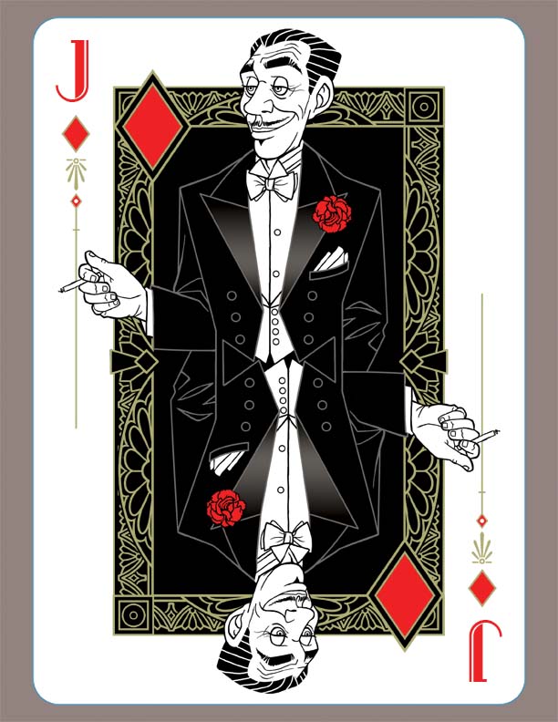
I'm currently working on a solo project that I hope to launch on KS soon. I want the theme to be the Roaring Twenties. I've always loved the time period and I would like to try and capture some of it in my designs. I only have one court done, but i wanted some input to see if I'm heading in the right direction.
looking forward to your comments,
Dave

- JoD.jpg (107.35 KiB) Viewed 2407 times
Re: Solo project
Posted: Mon Jul 31, 2017 1:07 pm
by Malthus1
Looks great to me.
The graphic design is really neat - the way the man's Tux fills the central space (making it look like he's got squared shoulders) really works for me. I assume that not every card will use the same trick for filling the space - I'm really looking forward to seeing what the others will look like.
The decorative details, font, etc. all give the right 'Roaring 20s' early Art Deco feel.
Re: Solo project
Posted: Tue Aug 01, 2017 8:08 am
by cartamundicards
amazing artwork! really loving the combination between the very clean decorations and the more illustrative character! it brings about an interesting tension! very excited to see what's next!
Re: Solo project
Posted: Tue Aug 01, 2017 9:44 am
by TGunitedcardists
I like it. I would like to see more.
Re: Solo project
Posted: Tue Aug 01, 2017 12:46 pm
by RichK
Love the concept. I don't like so much white space outside of the nicely detailed box you frame the JoD in. Also, the lack of body outline looks odd to me but it is your first court so I'll wait and see.
Th font, side adornments, and his face do scream 20's to me, along with the cigarette, so that's all positive for me.
Re: Solo project
Posted: Wed Aug 02, 2017 12:17 pm
by daveEdgerly
Thanks for the comments, all! The art is inspired by one of my all time favorite artists, J.C. Leyendecker. I hope to have more courts for you to look at soon. I haven't even begun to think about card back design yet, but I would love to hear your suggestions and design input. Also which printer I should use.
Re: Solo project
Posted: Thu Aug 03, 2017 11:04 am
by RichK
When I think the 20's I think speakeasy's, cars of that time, gangsters, flappers, elegant dress parties, great depression, hobo's hoping on trains, unemployment, stock market crash. Your card back, depending on your courts, could depict the good and bad elements of the era. Good luck with that unless you want one version of the era.
I see J.C. Leyendecker has a lot of high society art so try the good parts of the 20's on the back.
Re: Solo project
Posted: Fri Aug 04, 2017 10:43 pm
by NineLives
Hello Dave, this looks to be a really cool deck! Really love the personality you've brought out in JoD

It's clever to make the character fill the black rectangle - and I like how the buttons and kerchief help define this dapper dude. The gradient in the lapels is a bit distracting (to me) and I'm curious how it would look with just an outline ... OR ... marking the outline of his shoulders + waistline by drawing a white/grey line (on the black rectangle)? A subtle figure outline would add depth, while still keeping the original style & idea ... it might please the Queens too, who'll no doubt be asking for some definition to go with their plunging necklines

Either way - curious to see more
Re: Solo project
Posted: Sat Aug 05, 2017 7:48 am
by MagikFingerz
NineLives wrote:Hello Dave, this looks to be a really cool deck! Really love the personality you've brought out in JoD
It's clever to make the character fill the black rectangle - and I like how the buttons and kerchief help define this dapper dude. The gradient in the lapels is a bit distracting (to me) and I'm curious how it would look with just an outline ... OR ... marking the outline of his shoulders + waistline by drawing a white/grey line (on the black rectangle)? A subtle figure outline would add depth, while still keeping the original style & idea ... it might please the Queens too, who'll no doubt be asking for some definition to go with their plunging necklines
Either way - curious to see more
I was thinking pretty much exactly this, I just had difficulty putting it into words so I held off on posting.
So... Thanks, Annette!

Re: Solo project
Posted: Sun Aug 06, 2017 1:35 pm
by daveEdgerly
- JoD2.jpg (127.07 KiB) Viewed 2191 times
Great comments from everyone! I added a subtle outline and changed the frame to a gold metallic ink as well as expanded the border. I think the gold will help it pop a little more and also it will work better with the spades and clubs. looking forward to your input.
Dave
Re: Solo project
Posted: Mon Aug 07, 2017 11:41 am
by RichK
Much better looking! Thanks.
Re: The Roaring Twenties deck
Posted: Thu Aug 10, 2017 2:30 pm
by daveEdgerly
I just added a QoC design and tweaked the JoD. Looking forward to your input,
Dave
Re: The Roaring Twenties deck
Posted: Fri Aug 11, 2017 3:51 am
by flashcards
23 Skidoo, it's the bee's knees...I mean, awesome!
Re: The Roaring Twenties deck
Posted: Fri Aug 11, 2017 10:58 am
by RichK
I hope pink won't be a common color on all the courts. The pink fox looks a bit odd but design wise these are winners!
Re: The Roaring Twenties deck
Posted: Sat Aug 12, 2017 6:25 am
by TGunitedcardists
The background frame of black and gold seems to take away from the artwork. I'd like to see a version without it. I think it would probably look better.
Re: The Roaring Twenties deck
Posted: Sun Aug 13, 2017 10:28 am
by daveEdgerly
Here they are with no frame. I tweaked the colors as well. Personally I prefer the frame, but I would love to hear more from you all. I don't mind input and or criticism.
Re: The Roaring Twenties deck
Posted: Sun Aug 13, 2017 11:35 am
by RichK
I like the frame and tweaked colors. What if you tried frame without black "flood fill" so the white is inside the black and gold line work? Might make the bodies pop more.
Re: The Roaring Twenties deck
Posted: Mon Aug 14, 2017 8:00 am
by Malthus1
I like it better with the frame, myself - also I preferred the previous colours.
Re: The Roaring Twenties deck
Posted: Mon Aug 14, 2017 10:32 am
by TGunitedcardists
daveEdgerly wrote:Here they are with no frame. I tweaked the colors as well. Personally I prefer the frame, but I would love to hear more from you all. I don't mind input and or criticism.
Q&J2.jpg
I prefer the frameless these by a mile.
Re: The Roaring Twenties deck
Posted: Mon Aug 14, 2017 10:34 am
by JuFiN
I prefer frameless as well, although a lighter frame could be a possibility.
The pink was much better than the green for the accessories.
Re: The Roaring Twenties deck
Posted: Mon Aug 14, 2017 1:00 pm
by Levent Suberk
Very good drawings.
Re: The Roaring Twenties deck
Posted: Tue Aug 22, 2017 7:14 pm
by willroya
These do show real promise, good job. I would like to see it with the frame but with out the black fill. I wouldn't worry too much about colors until you get the main design done of all the courts and then just pick a few main colors and work from the palette and see what works best when you can compare them to one another.
Re: The Roaring Twenties deck
Posted: Mon Aug 28, 2017 10:30 pm
by NineLives
daveEdgerly wrote:I just added a QoC design and tweaked the JoD. Looking forward to your input,
Dave
Q&J.jpg
I think these look really cool
- To me the frame feels more complete with the association to mirrors and interior decoration used in old cinemas and bar lounges; placing your characters in the environment
(though you need to go with what feels right for you) ... I like how the Queen stands out more with the black around her (with her white skin popping)... and the Jack looks way better with the outline (compared to the earlier version
). Personally, I also like the pink (and I'm not someone who usually goes for pink), it just feels right with the fashion and the era
I agree with Will that you can tweak colours as you go, the drawings are looking great!